Case Study: Rhapsody
The Challenge
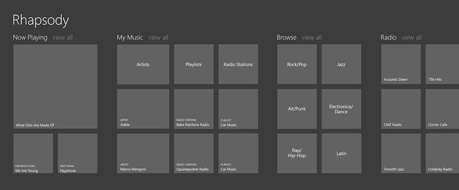
Blink partnered with Rhapsody, an international music service provider, to study and develop a metro-style concept of their application for Windows 8. One of Rhapsody's strengths is that it allows users to access music from everywhere via smartphone, desktop, and television apps. Since Windows 8 will soon be installed on millions of computers worldwide it is a potential new platform to support. The challenge was to create an experience that would feel familiar to current Rhapsody users and at the same time reflect Metro and Windows 8 principles and navigation structures.
Our Approach
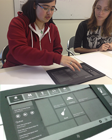
We began by closely analyzing the information architecture of existing Rhapsody instances, including the Windows Phone 7 app, the Android tablet app, and the Rhapsody.com website, to understand the features users would expect to find in the Windows 8 app. We also studied existing Windows 8 music and ecommerce applications to understand how they structure and surface content within the Metro style navigation hierarchy. This knowledge was used to design wireframes for all the major screens. One of the challenges we encountered was how to quickly test the application's information architecture without having to write code. To get around this we created a paper replica of the Windows 8 tablet in a 1:1 ratio in which we slid the wireframes. This allowed participants to touch and interact directly with the prototype; they could swipe the screen left and right and tap on tiles. We tested our prototype with ten participants and used the knowledge we gained to improve our design. We met often with Rhapsody to show them our progress and receive feedback, as well as more occasionally with Microsoft technical evangelists and designers to discuss our interpretation of the Windows 8 design rules. After the wireframes were finalized we explored a few concepts for the visual design and delivered the concept to Rhapsody.
Our Solution
We wanted to create an application that would both feel familiar to regular Rhapsody users, as well as fit within the Windows 8 design and navigational structure. This was quite challenging since many of the functions Rhapsody users are used to are considered chrome by Windows 8 standards and not a part of their design principles. Another problem was reconciling the 3-tiered Windows 8 navigation hierarchy with Rhapsody's deep genre hierarchy. In this section we discuss how we solved these design challenges.
Navigation
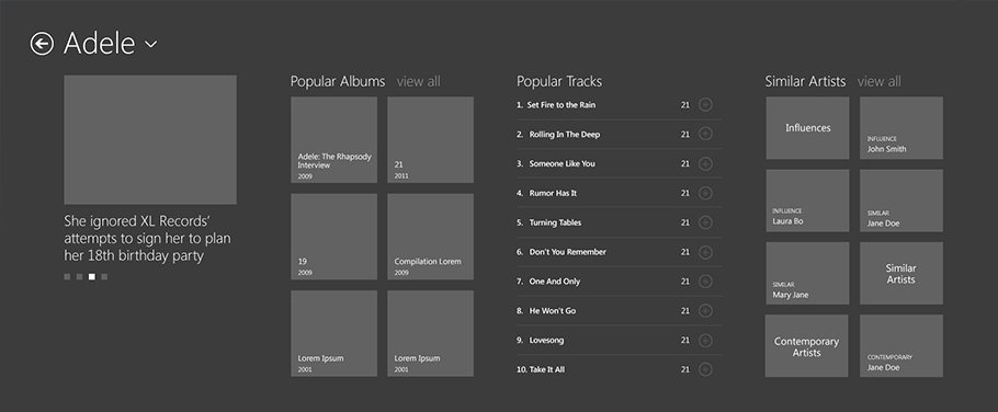
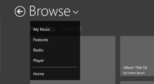
Rhapsody is a very deep hierarchical application, with multiple levels of genres and subgenres that exceed Windows 8's 3 levels. At the same time, it is also a wide navigation where the content is distributed between Browse, Featured, Radio, and My Music. Initially we were thinking of using the navigation bar to move between these sections. After discussing it with Windows 8 specialists from Microsoft we decided to revise this and use the initial hub screen to allow the user to move between them. This however, raised the question of how to return to the home screen when the user is deep in the hierarchy. After multiple iterations we decided to place the navigation in the header menu (the small arrow located next to headers). This allows users to access all the main sections of the site, and when possible the sibling pages (such as other genres or subgenres).
Small Music Player
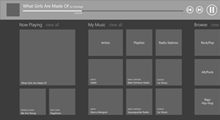
The player is one of the core parts of Rhapsody's user experience. Users want to know what they are currently listening to and what is coming up next. Initially, we placed a large player on the left side of the screen that showcased the album cover of the song currently playing as well as the user's entire queue. This however, took up a lot of real estate and conflicted with Metro's principle of no-chrome. Thus we also considered putting a smaller player in the upper right corner, similar to the Rhapsody app on other devices, or placing it in the app bar or navigation bar. MSDN recommends that music players use the navigation bar as the player; most applications currently on the market, however, use the app bar. In the end we decided to create a very simple player inside the navigation bar. This allows us to use the app bar for more traditional functionality, such as toggling views, and at the same time is easily accessible for the user. The player only displays the very essential information that users want to know and the controls to pause and change song. This player also links to a full-screen music player.
Full Screen Music Player
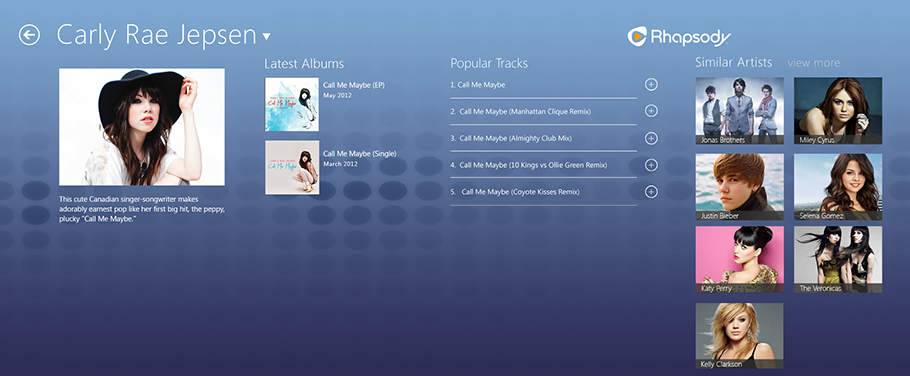
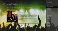
Metro is all about creating beautiful screens that showcase the application's content. Our full-screen player achieves this by prominently displaying the album cover of the song playing, as well as a background with additional artwork related to that artist or genre.
Play Album
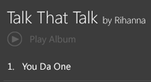
Another question that arose was how to allow the user to play an entire album. Initially, we were thinking of putting the play button in the app bar so that when the user selected a song or an album it would open automatically and allow the user to tap on play. We also wanted to incorporate gestures to allow the user to drag the album to the player to begin playing it immediately. However, after discussing these ideas with Rhapsody we decided to follow an approach that is more consistent with their apps on other platforms and include a plus sign next to the song and album to play it, add it to the queue, or add it to My Music.
