Windows Phone 7
Navigation and Commands
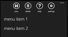
Application Bar
The application bar displays up to four common application tasks. The application bar can also expand into the application bar menu, which is accessed by tapping on the ellipsis on the right side. The app bar menu contains some of the less commonly used functionality and is generally limited to five functions.
Back
Windows Phone apps use the hardware back button to backtrack within applications.
Search
Search is usually accessed from the application bar or the application screen. Note that the hardware search button on the phone is only used to access Bing search and cannot be reprogrammed to search within your application.
Status Bar
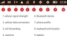
The status bar displays system-level status information such as: signal strength, data connection, roaming, wireless network signal, battery power, and the clock on the Windows Phone 7. The status bar can be hidden when an application is open, however, given that it contains important data, it is inadvisable to do so.
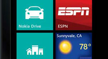
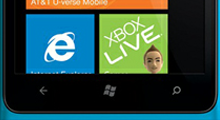
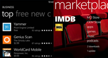
Tiles
Tiles on Start Screen are used to access an application. They should be 173 pixels x 173 pixels at 256 dpi and in PNG format. Currently the larger rectangular tiles can only be used by Microsoft applications. In addition to the large tile, designers also need to create a separate 62 pixels x 62 pixels image to include in the application list. Tiles are also used within applications to showcase and link to content.
Types of Layouts

Splash Screen
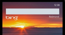
The splash screen is shown when the application is loading. This is a great place to display the logo and a background image that reflects the company's brand.
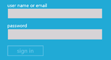
Main Launch Screen
This is the screen displayed by applications that require users to log in or enter a passcode.
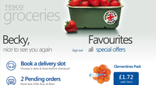
Panoramas
Panoramas in Windows Phone applications are similar to the Windows 8 Hub screen. They display the newest or most popular content from different sections of the application and allow users to navigate between them. The panorama surface is composed of panels that extand beyond the screen area. The user moves between them by flicking horizontally. The panorama usually has a picture in the background, which is also used as a visual indication that the panels continues beyond the visible area. Panoramas usually have a maximum of four or five panels; the first one is called the home panel.
Home Panel
The Home Panel is the first panel in a panorama. It is used as a starting point to navigate to subsections of the application. The links can be displayed either in a list format or with tiles. The home panel does not have to be the landing screen of the application. An application could also have multiple home panels.
Pivots
The Pivot Control is similar to tabs, it is generally used to categorize related information. The headers of the categories are displayed at the top of the screen; to navigate between them the user either swipes or taps on the header. It is advisable to limit the number of pivot pages to six. Oftentimes, pivots are used as second level pages.
Pivots vs. Panoramas
The main difference between Pivots and Panoramas is that the latter are intended for browsing the capabilities of the application, whereas pivots are meant for more efficient, focused, and habitual usage. Pivots are used to apply data filters, change app views, and display related content. Content in the pivots is optimized for the screen size, thus everything has to fit in the area viewed by the user. Content in Panorama panels extends beyond the viewable area. Panoramas and pivots should not be nested within each other. Panoramas also allow each panel to represent data in a different way, such as using tiles or lists, whereas pivots tend to use lists.
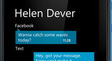
List with Details Drilldown
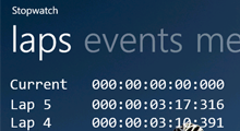
The List with Details Drilldown screen displays a list of items that the user can tap on to access a detailed view. This view is used instead of a pivot or panorama for very simple applications, such as the standard text messaging application.
The Grid and Typography
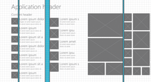
Grid
The Grid is used to achieve a uniform design between pages and applications on the Windows Phone platform. The columns and rows in the grid are 25 pixels wide and high with a 12 pixels gutter between them. Designers can also choose to create their own grid. For more information about the grid, refer to Arturo Toledo's blog entry.
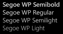
Typography
The standard font used for Windows Phone applications is Segoe WP. This font comes in six weights: light, semilight, regular, semibold, bold, and black. Most large headers are light or semilight, bodies of text are regular. The heavier weights are used occasionallyfor headers in the panorama view. Designers can choose to use fonts other than Segoe as long as they follow the Metro Principles.
Branding

Colors
Windows Phone users can choose between 2 themes (light and dark) and 10 accent colors. Applications designers can choose to follow the color scheme picked by the user, or overwrite it in order to better reflect their brand.
Backgrounds
Backgrounds are a common way to brand Windows Phone applications. In some cases, a background is used only for panoramas, while in other cases it is implemented on all screens.
Movement and animations
Movement is used in metro style applications to provide feedback to the user's touch and to make the system feel responsive. The following animations are provided through the Windows Phone SDK.
- Turnstile – used to jump between large spaces and from app to app. An example of this is to go from the start screen to an application.
- Continuum – the opposite of turnstile. It is used to drill down within the same application and signals to the user that the context remains the same.
- Swivel – a rotation used to signify that a transient UI element is opening.
- Slide – used when the user is drilling down an application and reaches a dead-end scenario.
Gestures
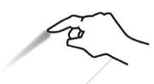
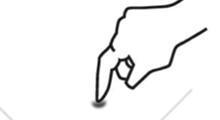
Tap
Tap is the most basic gesture and is used to navigate between screens. Users can tap on tiles, pivot headers, circled icons, and links. The recommended size for touch targets is 9 mm, and the minimum is 7 mm.
Double Tap
Double Tap is used to toggle between in and out zoom states. This is commonly used when browsing non-mobile sites.
Pan
Pan is a single finger placed on the screen and dragged across the screen in any direction. It is used to move content through direct manipulation, such as moving or reordering items in a list or tiles on the home screen.
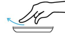
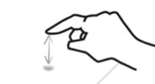
Flick
A Flick is a single finger down moved rapidly in any direction and ends with the finger lifted up off the screen. Flicks are generally used to move (scroll) on a page, although developers can specify to have individual objects move instead.
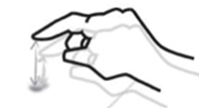
Touch and Hold
Touch and hold is used to open a context menu or options page for an item. For instance, on the Facebook app a user can touch and hold on a feed item to access the "like" button.
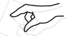
Pinch and Stretch
Pinch and Stretch is used to zoom in and out of pages and is commonly used when browsing non-mobile websites.
Resources
- Windows Phone user experience design
- Windows Phone PSD Templates (and PDF explanation)
- Windows Phone Design Day Recordings
- Central Application Hub with Home Page Menu (Panorama or Pivot Control) for Windows Phone
- Gestures
- Tiles
- Windows Phone Design Day – Metro Fundamentals [Spanish]
- Grids and Typography [Spanish]
- Windows Phone Design Day Documents [English]
- Arturo Toledo's blog entry about the grid (lots of resources!)
- Windows Phone Design Days Recordings