Windows 8
Navigation and Commands

App Bar
The app bar is located at the bottom of the screen and is shown by swiping up from the bottom edge, or down from the top edge. It contains commands that are relevant to the current screen. The icons are typically equally split between the left and the right side of the screen, so they are easier to tap with the thumb. On the left are commands that relate to the content that is currently being shown. on the right there are global commands that apply to multiple pages. The app bar is also used to provide commands when a specific element, such as a tile, is selected.

Navigation Bar
The navigation bar is located at the top of the screen and is activated by swiping up from the bottom edge of the screen, or down from the top edge. It is used to navigate between different sections of an application. For instance, the News360 app uses it to access hub pages to specific types of news, such as Global, US, and Crime. The advantage of the navigation bar is that it is accessible on every page of the application.

Charms
Charms are commands that are available for all Windows 8 applications. They are shown by swiping left from the right edge of the screen. They include commands such as "Search", "Share", "Settings", "Devices", and "Start". Search allows the user to search both within the current application, as well as files and other apps. Share lets users share the content with other applications, such as social networking apps. Settings can be both specific to the current application and system-wide.

Hierarchy
Most Windows 8 apps use a hierarchical system of navigation based on three screens: the hub page, the section page, and the detail page. Pages lower in the hierarchy can be accessed by tapping on tiles or headers in hub and section pages.
Types of Pages

Hub Page
The Hub page is the user's entry point to the app. Hub screens use tiles in a grid layout to make the content visually interesting and easy to interact with. The Hub is supposed to engage users, showcase the most important content, and allow them to navigate to different sections of the app.

Section Page
Section pages are the second level in the hierarchical structure. The content can be displayed in any form, including groups of tiles or lists. Each content item is linked to a detail page that elaborates on it. Selection pages are accessed by tapping on a "see more" tile or header on the Hub screen.

Detail Page
The detail page is the lowest level in the hierarchy. The content can include text, pictures, video, or songs.
The Grid and Typography
Grid
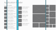
Metro applications are based on a strict grid layout. The grid is made up of units, which are 20x20px in size. The grid is used to create a uniform layout between multiple applications, reinforcing the focus on content rather than chrome. For instance, Microsoft recommends having two unit between top level headers and the content, and one unit between tiles. To learn more about the grid, visit MSDN.

Segoe UI
Segoe UI is the font provided by Microsoft for Windows 8 applications. It is a sans-serif font that comes in multiple weights: light, semilight, regular, semibold, and bold. The most common font sizes for Segoe UI are 11, 9, 20, and 42pt; these sizes are designed to fit well in the Windows 8 grid. Other standard fonts are Calibri for text that is inputted and read by the user, and Cambria for large blocks of text.
Branding

Application
One of the main challenges for businesses wanting to create custom Windows 8 apps is reaching a balance between metro style and their brand. One of the core ideas behind Windows 8 is to unify the experience between apps so the user can focus more on the content than on the surrounding chrome. This means that applications are not branded as much as they would be in iOS or Android devices. One way to reach a balance is to customize the background in a way that reflects the company's brand. Many companies also use their logo instead of the 42pt header on the Hub page.

Live Tile
The live tile appears on the start screen. It shows the company logo and in some cases updates from the application, such as a new email or article published. The live tile is the users' first encounter with the application, it has to entice them to open it, and keep them informed when they are working on other things. The tile should use the brand's main color and logo.
Gestures

Sliding horizontally
Sliding horizontally is used to scroll horizontally on wide pages. It is the equivalent of using the scroll wheel or moving the navigation bar with the mouse.

Swiping horizontally
Swiping horizontally from the right edge of the screen is used to show charms. The equivalent of this with the mouse is to right click on the right edge of the screen. Swiping from the left edge of the screen opens a minimized application. Swiping from the left edge and stopping after about an inch, shows all minimized applications.

Swiping Vertically
Swiping vertically from the top or bottom edge of the screen is used to show the nav and app bars. The equivalent of this with the mouse is to right click on the bottom edge of the screen.

Pinch and Stretch
Pinch and stretch is used to activate and deactivate semantic zoom.